A new, refreshed logo and visual identity have been unveiled to celebrate the 70th anniversary of the Eurovision Song Contest.
The new logo brings the words ‘Song Contest’ into higher prominence, highlighting the whole of the competition’s name, not just the word Eurovision.

A special brand asset has also been created as Eurovision gets close to its 70th edition in Austria next year.
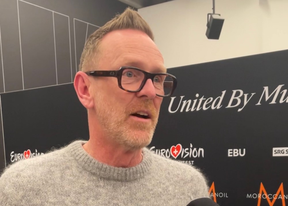
In his first interview since the brand reveal, ESC Director Martin Green told The Euro Trip: “It’s a really nice moment and it’s something I’d wanted to do more or less from the start when I came in last year.
“I felt it was time that we freshened ourselves up. Eurovision is a young event. It’s about pop music and reflects current times, and I think our identity needs to do that too. We have our 70th edition next year so it was as good an excuse as any to do it.
“We wanted to do something specifically about celebrating 70, but also refresh ourselves for the next 10 years or so.
“There was something pragmatic. As we get bigger, on behalf of our fans and members, I want to make sure our brand was protectable. That’s important when it comes to our sponsors and members.
“Having a font that we can completely own, as well as the fun of putting a new frock and having a makeover.”
The familiar Eurovision heart logo remains, but in a new, adaptable way.
What organisers call the “Chameleon Heart” – Eurovision’s “emotional compass” – “absorbs cultural influences, music, and movement,” according to a Eurovision press release.
Eurovision’s new typeface that it owns is called Singing Sans.
The new logo and identity have been described as “an evolution, not a revolution” by Eurovision’s Brand Manager Lina Moussaoui.
It will be used for the first time at a Eurovision event at December’s Junior Eurovision Song Contest in Tbilisi, Georgia.

Eurovision’s previous logo had been used since the Istanbul-hosted contest in 2004, and underwent a slight revamp in the summer of 2014.
That 2014 brand identity tidy up was part of the contest’s 60th anniversary celebrations. Eight months later, Eurovision hosted Eurovision Song Contest’s Greatest Hits, a special one-off show dedicated to the diamond anniversary.
Contest organisers did not unveil plans today for a similar celebratory event, but the EBU is looking at marking the 70th anniversary further.
In an interview with Sky History in 2024, the EBU’s Digital and Communications Manager, Dave Goodman, said his organisation was “trying to digest our archive and make some of it available” while “planning for the 70th anniversary”.
In the same interview, Goodman also admitted to his quest to find the missing footage of the 1956 and 1964 contests, suggesting its potential use at next year’s celebration show.


2 Comments Add yours